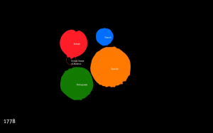
[img: Pedro Miguel Cruz, Empires decline – revisited, 2010]
Early data visualizations in science ordered information in tree-like representations to address issues of classification and genealogy. The Encyclopédie’s Systême figuré des connaissances humaines and Darwin’s Tree of life are classical examples of this first period of data visualization. The recent shift towards issues of organized complexity in scientific inquiry (Weaver, 1948) has changed the practice of visualization, marking a transition from trees to networks. Despite a rich stream of research, network visualization still lacks a basic grammar of standardized graphic presentation as that advocated by Willard Brinton (Brinton, 1939) and Jacques Bertin (Bertin, 1999). The session will first address visualizing complexity from a analytical perspective, stressing the importance of information design and visual standards for improved perception and understanding of complex phenomena. It will then critically discuss what some have labeled “an established language of graphic abstraction” and present an expressive approach to data visualization.
[14h30-15h45] The seminar will start with a collective discussion of the articles listed below. There will be a brief presentation and comments on the texts provided by Débora de Carvalho Pereira and Axel Lagnau to help launch the discussion.
- Cruz, P. & Machado, P., (2011), Generative Storytelling for Information Visualization. Computer Graphics and Applications, IEEE, 31(2), 80–85. (link)
- Friendly, M., (2008), A Brief History of Data Visualization. In Springer Handbooks Comp.Statistics. Handbook of Data Visualization. Springer Berlin Heidelberg, 15–56. (link)
- Healy, K. & Moody, J. (forthcoming), Data Visualization in Sociology. Anual Review of Sociology. (link)
- Offenhuber, D., (2010), Visual Anecdote. Leonardo, 43(4), 367–374. doi:10.1162/LEON_a_00010 (link)
[15h45-16h00] Pause
[16:00-17:15] Pedro Miguel Cruz of the Universidade de Coimbra will be the guest of this session and give a talk on Storytelling, metaphors and visualization. His presentation will be discussed via Skype by Donato Ricci of Science Po’s medialab and the Politecnico di Milano. Cruz’s talk will offer a counterpoint to the articles discussed in the first part of the seminar, focusing on expressiveness rather than standards in data visualization. According to Cruz, the current rise of information visualization has breathed new life, unfortunately, into an established language of graphic abstraction (Brinton, 1939, Bertin, 1967). With the increase of publicly available information related to the social sciences (urban development, history, political science and sociology) data is often treated with abstract visual representations suitable for analytical analysis (Friendly, 2008). This session will address alternative idioms of visualization through an exploration of a number of case studies. These alternative languages of the visual are intended to produce visual applications that better acquaint broad audiences to publicly relevant datasets, create compelling data narratives and raise awareness for the subjects under study. This session will address topics such as storytelling in visualization (Cruz, 2011), the role of graphical metaphors to enrich communication and the use of imprecisions in the representation of information in order to emphasize certain aspects in the data. This presentation takes the stand that visualization should be a more expressive activity and that developers of data visualizations need to wield the plume of the storyteller as much as the protractor of the engineer.
[17:15-18:00] Open discussion
The seminar is open to all. If you are interested in participating, however, please sign up on our website here.
Storytelling, metaphors and visualization : Pedro Miguel Cruz – University of Coimbra (1 of 2)
Storytelling, metaphors and visualization : Pedro Miguel Cruz – University of Coimbra (2 of 2)

